Compressing and enhancing hand-written notes
I wrote a program to clean up scans of handwritten notes while simultaneously reducing file size.
Example input and output:
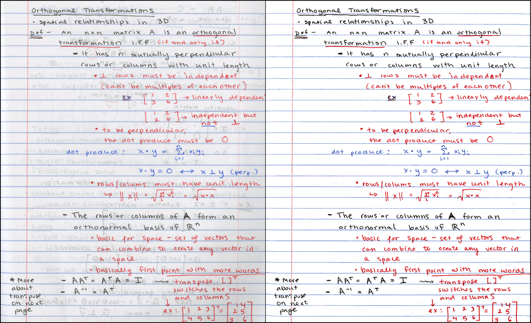
Left: input scan @ 300 DPI, 7.2MB PNG / 790KB JPG. Right: output @ same resolution, 121KB PNG.1
Disclaimer: the process described here is more or less what the Office Lens app does already, and there’s probably any number of other tools that do similar things. I’m not claiming to have come up with a radical new invention – just my own implementation of a useful tool.
If you’re in a hurry, just check out the github repo, or jump down to the results section, where you can play with interactive 3D diagrams of color clusters.
Motivation
Some of my classes don’t have an assigned textbook. For these, I like to appoint weekly “student scribes” to share their lecture notes with the rest of the class, so that there’s some kind written resource for students to double-check their understanding of the material. The notes get posted to a course website as PDFs.
At school we have a “smart” copier capable of scanning to PDF, but the documents it produces are… less than attractive. Here’s some example output from a handwritten homework page:
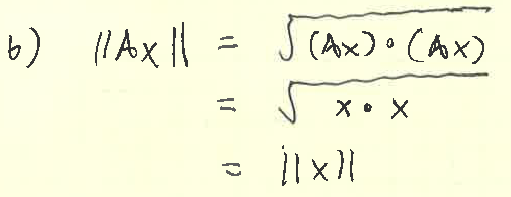
Seemingly at random, the copier chooses whether to binarize each mark (like the x’s), or turn them into abysmally blocky JPGs (like the square root symbols). Needless to say, we can do better.
Overview
We start out with a scan of a lovely page of student notes like this one:
The original PNG image scanned at 300 DPI is about 7.2MB; the same image converted to a JPG at quality level 85 is about 790KB.2 Since PDFs of scans are typically just a container format around PNG or JPG, we certainly don’t expect to reduce the required storage size when converting to PDF. 800KB per page is pretty hefty – for the sake of loading times, I’d love to see things closer to 100KB/page.3
Although this student is a very neat note-taker, the scan shown above looks a bit messy (through no fault of her own). There’s lots of bleed-through from the opposite side of the page, which is both distracting for the viewer and hard for a JPG or PNG encoder to compress, compared to a constant-color background.
This is what the output of my noteshrink.py program looks like:
It’s a comparatively tiny PNG file, weighing in at just 121KB. My favorite part? Not only did the image get smaller, it also got clearer!
Process and color image fundamentals
Here are the steps required to produce the compact, clean image above:
-
Identify the background color of the original scanned image.
-
Isolate the foreground by thresholding on difference from background color.
-
Convert to an indexed color PNG by choosing a small number of “representative colors” from the foreground.
Before we delve into each one of these steps, it might be useful to recap how color images are stored digitally. Because humans have three different types of color-sensitive cells in their eyes, we can reconstruct any color by combining various intensities of red, green, and blue light.4 The resulting system equates colors with 3D points in the RGB colorspace, illustrated here:5
Although a true vector space would allow an infinite number of continuously varying pixel intensities, we need to discretize colors in order to store them digitally – typically assigning 8 bits each to the red, green, and blue channels. Nevertheless, considering colors in an image analogously to points in a continuous 3D space provides powerful tools for analysis, as we shall see when we step through the process outlined above.
Identifying the background color
Since the majority of the page is free from ink or lines, we might expect the paper color to be the one that appears most frequently in the scanned image – and if the scanner always represented every bit of unmarked white paper as the same RGB triplet, we would have no problems picking it out. Regrettably, this is not the case; random variations in color appear due to dust specks and smudges on the glass, color variations of the page itself, sensor noise, etc. So in reality, the “page color” can spread across thousands of distinct RGB values.
The original scanned image is 2,081 x 2,531, with a total area of
5,267,011 pixels. Although we could consider each individual pixel,
it’s much faster to work on a representative sample of the input
image. The noteshrink.py program samples 5% of the input image by
default (more than sufficient for scans at 300 DPI), but for now,
let’s look at an even smaller subset of 10,000 pixels chosen at random
from the original scan:
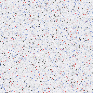
Although it bears scant resemblance to the actual scanned page – there’s no text to be found – the distribution of colors in the two images is pretty much identical. Both are mostly grayish-white, with a handful of red, blue, and dark gray pixels. Here are the same 10,000 pixels, sorted by brightness (e.g. the sum of their R, G, and B intensities):
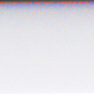
Viewed from afar, the bottom 80-90% of the image all seems to be the same color; however, closer inspection reveals quite a bit of variation. In fact, the most frequent color in the image above, with RGB value (240, 240, 242), accounts for just 226 of the 10,000 samples – less than 3% of the total number of pixels.
Because the mode here accounts for such a small percentage of the sample, we should question how reliably it describes the distribution of colors in the image. We’ll have a better chance of identifying a prevalent page color if we first reduce the bit depth of the image before finding the mode. Here’s what things look like when we move from 8 bits per channel to 4 by zeroing out the four least significant bits:

Now the most frequently occurring color has RGB value (224, 224, 224), and accounts for 3,623 (36%) of the sampled pixels. Essentially, by reducing the bit depth, we are grouping similar pixels into larger “bins”, which makes it easier to find a strong peak in the data.6
There’s a tradeoff here between reliability and precision: small bins enable finer distinctions of color, but bigger bins are much more robust. In the end, I went with 6 bits per channel to identify the background color, which seemed like a good sweet spot between the two extremes.
Isolating the foreground
Once we have identified the background color, we can threshold the image according to how similar each pixel in the image is to it. One natural way to calculate the similarity of two colors is to compute the Euclidean distance of their coordinates in RGB space; however, this simple method fails to properly segment the colors shown below:
Here’s a table specifying the colors and their Euclidean distances from the background color:
| Color | Where found | R | G | B | Dist. from BG |
|---|---|---|---|---|---|
| white | background | 238 | 238 | 242 | — |
| gray | bleed-through from back | 160 | 168 | 166 | 129.4 |
| black | ink on front of page | 71 | 73 | 71 | 290.4 |
| red | ink on front of page | 219 | 83 | 86 | 220.7 |
| pink | vertical line at left margin | 243 | 179 | 182 | 84.3 |
As you can see, the dark gray bleed-through that we would like to classify as background is actually further away from the white page color than the pink line color which we hope to classify as foreground. Any threshold on Euclidean distance that marks pink as foreground would necessarily also have to include the bleed-through.
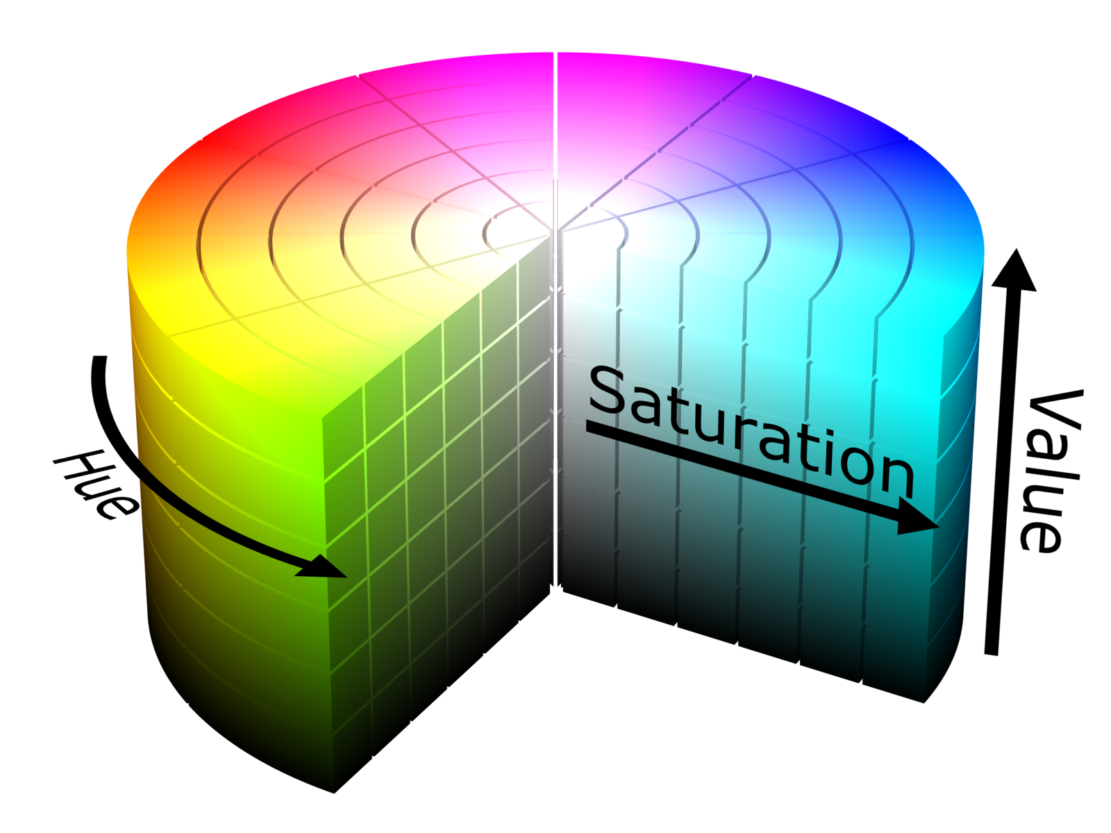
We can get around this issue by moving from RGB space to Hue-Saturation-Value (HSV) space, which deforms the RGB cube into the cylindrical shape illustrated in this cutaway view:7
The HSV cylinder features a rainbow of colors distributed circularly about its outside top edge; hue refers to the angle along this circle. The central axis of the cylinder ranges from black at the bottom to white at the top, with gray shades in between – this entire axis has zero saturation, or intensity of color, and the vivid hues on the outside circumference all have a saturation of 1.0. Finally, value refers to the overall brightness of the color, ranging from black at the bottom to bright shades at the top.
So now let’s reconsider our colors above, this time in terms of value and saturation:
| Color | Value | Saturation | Value diff. from BG | Sat. diff from BG |
|---|---|---|---|---|
| white | 0.949 | 0.017 | — | — |
| gray | 0.659 | 0.048 | 0.290 | 0.031 |
| black | 0.286 | 0.027 | 0.663 | 0.011 |
| red | 0.859 | 0.621 | 0.090 | 0.604 |
| pink | 0.953 | 0.263 | 0.004 | 0.247 |
As you might expect, white, black, and gray vary significantly in value, but share similarly low saturation levels – well below either red or pink. With the additional information provided by HSV, we can successfully mark a pixel as belonging to the foreground if either one of these criteria holds:
- the value differs by more than 0.3 from the background color, or
- the saturation differs by more than 0.2 from the background color
The former criterion pulls in the black pen marks, whereas the latter pulls in the red ink as well as the pink line. Both criteria successfully exclude the gray bleed-through from the foreground. Different images may require different saturation/value thresholds; see the results section for details.
Choosing a set of representative colors
Once we isolate the foreground, we are left with a new set of colors corresponding to the marks on the page. Let’s visualize the set – but this time, instead of considering colors as a collection of pixels, we will consider them as 3D points in the RGB colorspace. The resulting scatterplot ends up looking quite “clumpy”, with several bands of related colors:
Our goal now is to convert the original 24 bit-per-pixel image into an indexed color image by choosing a small number (8, in this example) of colors to represent the whole image. This has two effects: first, it reduces the file size because specifying a color now requires only 3 bits (since \(8 = 2^3\)). Furthermore, it makes the resulting image more visually cohesive because similarly colored ink marks are likely to be assigned the same color in the final output image.
To accomplish this goal we will use a data-driven method that exploits the “clumpy” nature of the diagram above. Choosing colors that correspond to the centers of clusters will lead to a set of colors that accurately represents the underlying data. In technical terms, we’ll be solving a color quantization problem (which is itself just a special case of vector quantization), through the use of cluster analysis.
The particular methodological tool for the job that I picked is k-means clustering. Its overall goal is to find a set of means or centers which minimizes the average distance from each point to the nearest center. Here’s what you get when you use it to pick out seven different clusters on the dataset above:8
In this diagram, the points with black outlines represent foreground color samples, and the colored lines connect them to their closest center in the RGB colorspace. When the image is converted to indexed color, each foreground sample will get replaced with the color of the closest center. Finally, the circular outlines indicate the distance from each center its furthest associated sample.
Whistles and bells
Aside from being able to set the value and saturation thresholds, the
noteshrink.py program has several other notable features. By
default, it increases the vividness and contrast of the final palette
by rescaling the minimum and maximum intensity values to 0 and 255,
respectively. Without this adjustment, the 8-color palette for the
scan above would look like this:

The adjusted palette is more vibrant:

There is also an option to force the background color to white after
isolating the foreground colors. To further reduce the PNG image
sizes after conversion to indexed color, noteshrink.py can
automatically run PNG optimization tools such as optipng,
pngcrush, or pngquant.
The program’s final output combines several output images together
into PDFs like this one using ImageMagick’s convert tool. As a
further bonus, noteshrink.py automatically sorts input filenames
numerically (as opposed to alphabetically, as the shell globbing
operator does). This is helpful when your dumb scanning program9
produces output filenames like scan 9.png and scan 10.png, and you
don’t want their order to be swapped in the PDF.
Results
Here are some more examples of the program output. The first one (PDF) looks great with the default threshold settings:
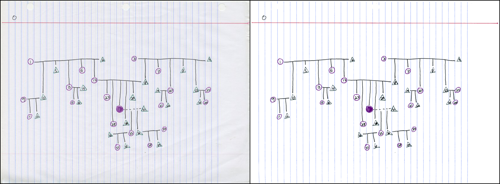
Here is the visualization of the color clusters:
The next one (PDF) required lowering the saturation threshold to 0.045 because the blue-gray lines are so drab:
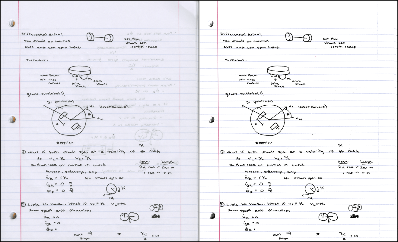
Color clusters:
Finally, an example scanned in from engineer’s graph paper (PDF). For this one, I set the value threshold to 0.05 because the contrast between the background and the lines was so low:
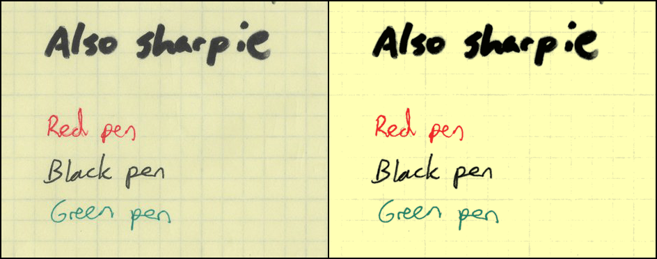
Color clusters:
All together, the four PDFs take up about 788KB, averaging about about 130KB per page of output.
Conclusions and future work
I’m glad I was able to produce a practical tool that I can use to prepare scribe note PDFs for my course websites. Beyond that, I really enjoyed preparing this writeup, especially because it prodded me to try to improve on the essentially 2D visualizations displayed on the Wikipedia color quantization page, and also to finally learn three.js (very fun, would use again).
If I ever revisit this project, I’d like to play around with alternative quantization schemes. One that occurred to me this week was to use spectral clustering on the nearest neighbor graph of a set of color samples – I thought this was an exciting new idea when I dreamed it up, but it turns out there’s a 2012 paper that proposes this exact approach. Oh well.
You could also try using expectation maximization to form a Gaussian mixture model describing the color distribution – not sure if that’s been done much in the past. Other fun ideas include trying out a “perceptually uniform” colorspace like L*a*b* to cluster in, and also to attempt to automatically determine the “best” number of clusters for a given image.
On the other hand, I’ve got a backlog of blog entries to shove out the
door, so I’m going to put a pin in this project for now, and invite you to go
checkout the noteshrink.py github repository. Until next time!
Comments
Great post and great application
Hi there, I can't run the program, it gives me this output and I can't solve the problem by myself, I'm running Debian Jessie... I'm testing using one of the images from this webpage.
Traceback:
$ noteshrink /home/lordford/Downloads/notesA1.jpg
opened /home/lordford/Downloads/notesA1.jpg
getting palette...
Traceback (most recent call last):
File "/usr/local/bin/noteshrink", line 9, in <module>
load_entry_point('noteshrink==0.1.0', 'console_scripts', 'noteshrink')()
File "build/bdist.linux-x86_64/egg/noteshrink.py", line 582, in main
File "build/bdist.linux-x86_64/egg/noteshrink.py", line 558, in notescan_main
File "build/bdist.linux-x86_64/egg/noteshrink.py", line 381, in get_palette
File "build/bdist.linux-x86_64/egg/noteshrink.py", line 106, in get_bg_color
TypeError: unique() got an unexpected keyword argument 'return_counts'
Yep, I was unaware return_counts was a recently added option in numpy.unique. You will need numpy 1.10 or greater to run the script. I have updated the requirements.txt in the repo, but I haven't yet incremented my version number and re-uploaded to PyPI, working on it...
Only linux? :(
It should work on any system where you can install Python and the requirements, including windows.
Congratulations for interesting software and for very clear writing, showing non-trivial algorithm in very understandable way. Thank you.
Thanks!
Hi! Thanks for providing this tool. I was trying to make it work with Python 2.7 but, after installing the required packages successfully I get the following error:
"running PDF command "convert page0000.png output.pdf"..."
"warning: PDF command failed"
And only PNG is generated.
Do you know what should be failing?
Thanks in advance!
Yes, it looks like the ImageMagick software is not installed. Please see http://www.imagemagick.org/scr... or use your usual package manager (apt-get/macports/homebrew/etc.) to install it.
Hi, thank you for this tool. I would like to know whether is possible to
convert pdf files.
I have been trying to convert my pdf's as png, but the quality is not the best, so the final output does not have the best resolution.
Dear Matt, a user from a german forum asked me / the community if someone would create a GUI for your noteshrinker... (additionally to the django based which is alread existing). Therefor I would get in touch with you via email, if it is possible and wanted by you... (of course it will be open source and hosted on github...) hopefully you can see my mail-adress due to this comment... Regards Matthias
Hi Matthias - the software is open sourced with a very permissive license. There's nothing stopping anyone from picking it up and doing pretty much whatever they'd like with it. I don't have time to support development of a GUI but I encourage you and your fellow forum members to go for it!
Hey Matt, thanks for your fast reply! Of course we will take care of development of the GUI ;-) no support from your side should be needed... your programm is in a good shape and structure. I just wanted to be sure and have asked for your permission (beside the MIT license) :-D Maybe in a few weeks / months(?) depending on my time which I can spend I'll get in touch with you again, just to let you know the github repo of the finished GUI! Thanks so far and best regards from Germany,
Matthias
Hi Matt, here you can find the first alpha if you want to have a look at it -> https://github.com/Acer54/note... ... for Win User, there is a zip file with all dependencies ... for Linux and Mac only source code is available. Take a look at the release notes as well... I have made a few changes, e.g. replacing PIL and Imagemagick with qt4 libs. Regards, Matthias
Hey, have you tried using graphics magick instead of image magick?
No, I imagine it would probably work as long as the command line arguments to 'convert' haven't been changed too much...
-
Handwritten note samples are presented with the generous permission of my students Ursula Monaghan and John Larkin. ↩
-
The image shown here is actually downsampled to 150 DPI to allow the page to load faster. ↩
-
One thing our copier does do well is keep PDF sizes down – it gets about 50-75 KB/page for these types of documents. ↩
-
This makes red, green, and blue the additive primary colors. Your elementary school art teacher may have told you that the primary colors are red, yellow and blue. This is a lie; however, there are three subtractive primary colors: cyan, yellow, and magenta. The additive primaries relate to combining light (which is what monitors emit), whereas the subtractive colors relate to combining pigment found in inks and dyes. ↩
-
Image courtesy Wikimedia Commons user Maklaan. License: CC BY-SA 3.0 ↩
-
Check out the “tips” example in Wikipedia’s histogram article for another illustration of why increasing the bin size helps. ↩
-
Image courtesy Wikimedia Commons user SharkD. License: CC BY-SA 3.0 ↩
-
Why k=7 and not 8? We want 8 colors in the final image, and we already have identified a background color… ↩
-
Yes, I’m glaring at you, Mac OS Image Capture… ↩




Comments are closed, see here for details.